Cinematic Composition Challenge: Wes Anderson's greatest movie
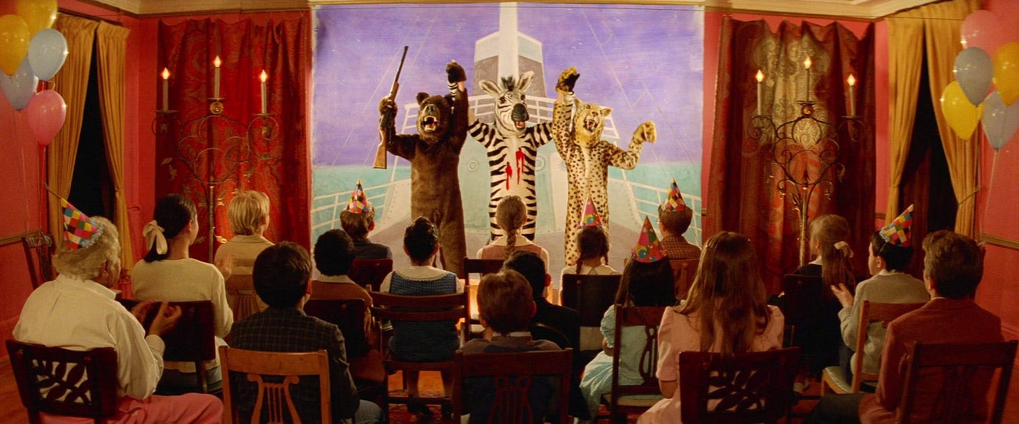
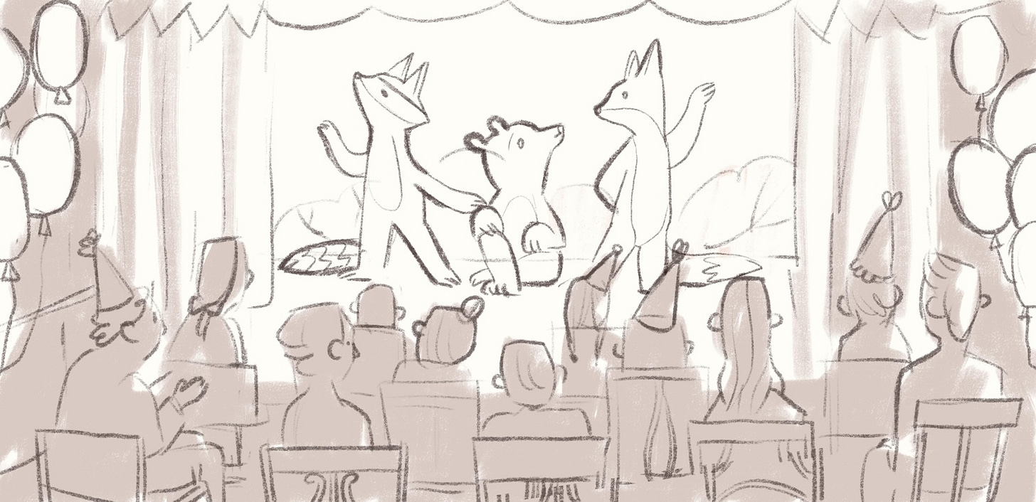
This movie scene had everything: birthday hats, vintage vibe and a bear with a gun. I softened the edges and turned it into a children's book illustration
Hello again!
It’s the end of June, and I’m back with another scene breakdown where I analyze a movie still and turn it into a picture book-style illustration. It’s fourth entry in the Cinematic Composition Challenge! This month it’s Wes Anderson and a slightly awkward kid’s play.
In the Archive you can catch up on the previous ones:
As always, I asked subscribers in the chat to choose between three options:
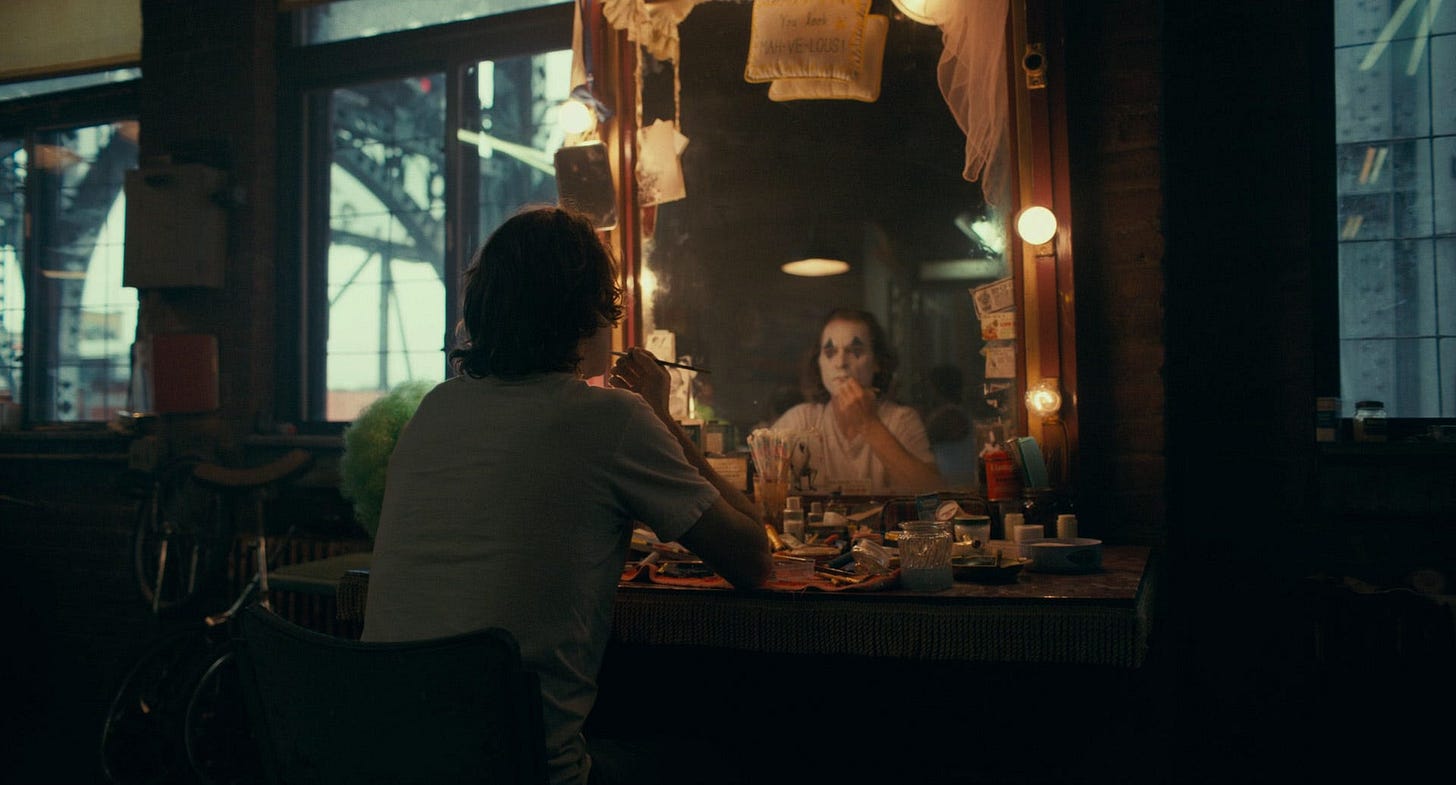
The voting was fierce between Joker and The Royal Tenenbaums. It seems you really liked both! But in the end, Wes Anderson won.
Honestly? Quite excited about it. I’m Wes Anderson fan and I love his vintage aesthetics and weird storytelling. The Royal Tenenbaums is one of my favorites. I first saw it by total accident, flipping through TV channels maybe 15 years ago? (remember the pre-Netflix days when you could just stumble onto a movie?) I saw Gene Hackman and Gwyneth Paltrow and thought: “why not?”. And what a lovely surprise it turned out to be. Do you miss that feeling of randomly finding something great? I do. (Yes, I’m officially old)
Anyway! Back to our Challenge. I usually try to make the scene completely “my own,” but this time I stayed much closer to the original. This movie still is just so good as it is. I didn’t want to mess with it too much. So this month, I’m being a bit less inventive and a bit more appreciative of Wes Anderson’s aesthetic. Hope that’s okay with you.
Step 1: How does it make me feel?
As always, I set the plot aside and focus on the still itself.
The place looks cosy. Audience sit in rows, watching a performance on a tiny stage. There’s a bear holding a rifle, a zebra with a blood stain, and a leopard. The scene is… odd. It’s clearly meant to be a kid’s play, but there’s some level of discomfort, isn’t there? Like the audience isn’t quite sure how to respond. Some clap, others look slightly confused. The birthday hats, balloons, and paper set pieces are charming, but the costumes and props (especially the rifle) make things a bit dark. I love that ambiguity!
The color palette is warm: reds, yellows, and browns, with soft lighting that gives the whole room a nostalgic vibe. On the other hand, the background on the stage has very cold tones which creates a good contrast and make the characters stand out more.
Step 2: What composition rules do I notice?
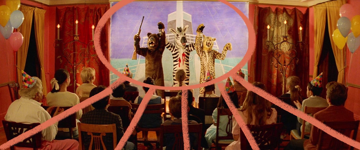
The composition is almost perfectly symmetrical (classic Wes Anderson!) The audience is seated and facing forward. They form natural leading lines that draw our eyes to the center stage, where the three anima performers stand. The heavy red curtains and candelabras on either side create a nice visual frame. Everything is carefully arranged to keep our focus exactly where it needs to be. It all creates a scene that feels like a picture book illustration already (which is probably why I didn’t want to change much this time!)
Step 3: How can I adapt this?
Usually in this series, I take a movie still and apply quite a lot of changes: the setting, the characters, the atmosphere. But this time, I wanted to stay close to the original. There’s something delightful about the idea of a school play or a kids’ party performance. That said, I did want to soften it a little.
Step 4: Make it my own
The biggest change I made was to remove the rifle and the blood. I also swapped the characters for a fox, a raccoon, and a bear. Why? Well, I just like those animals better.
I stuck with the central composition and used the audience as natural framing and leading lines. But as I started sketching, I realized something: this kind of layout wouldn’t really work as a double spread in a picture book. The main characters would end up lost in the gutter. So instead, I treated it like a standalone piece. We can break out of the picture book mindset and just explore composition for what it is, can’t we?
Your Turn!
What do you think? Would you have chosen The Royal Tenenbaums too? Have you ever tried turning a movie still into an illustration?
I’d love to see your take. You can use this still, or pick your own and follow the same process. If you do, share it in the comments or reply in the chat!
Until next time,
P.S. In two weeks, this post will be archived and only available to paid subscribers. Becoming a paid subscriber gives you full access to all past Cinematic Composition Challenges, plus weekly Analog Day sketchbook prompts and one live drawing session each month. It’s kind of a steal! At least, I hope it is.








i absolutely love Wes Andersen, and I love your composition breakdowns! using movies to inspire your own illustration is brilliant! i’m excited to try this🥰
Love it! And I’m pretty sure it’s a fact that films are better when they’re on live telly. Nothing beats that feeling of being ready for bed, going to switch the telly off and seeing the opening titles of a classic.